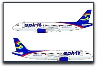
One of our readers just sent me a copy of an artist rendering from Airliners.net, which is supposedly the new Spirit livery.
As our reader noted, “Ugly, boring, hideous. I am not sure if that is the correct term but I don’t think I like it.”
I think the correct term might be….”Blecccch.”
What do you think?
Technorati Tags: airlines, Spirit Airlines

I think it looks better than Skybus’ livery. Of course, that’s not saying much.
Well, yes, I wouldn’t disagree with you on that one. It does look rather, er, festive. But not ugly. SkyBus does rank highly in that category.